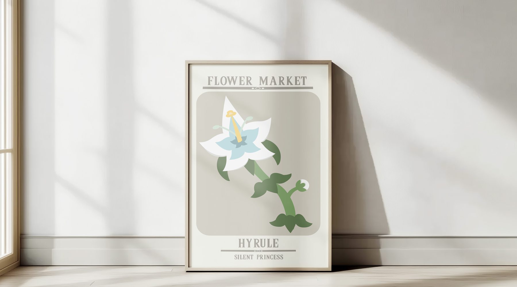
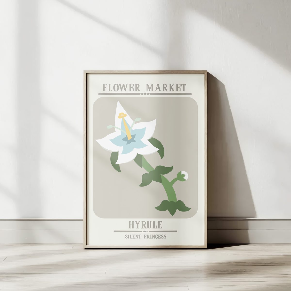
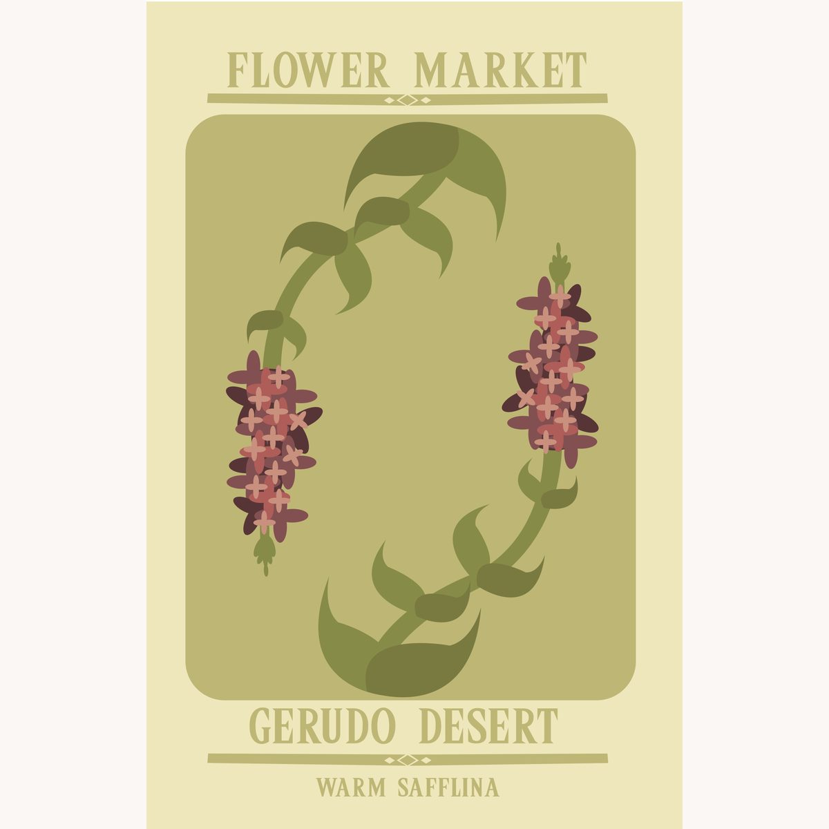
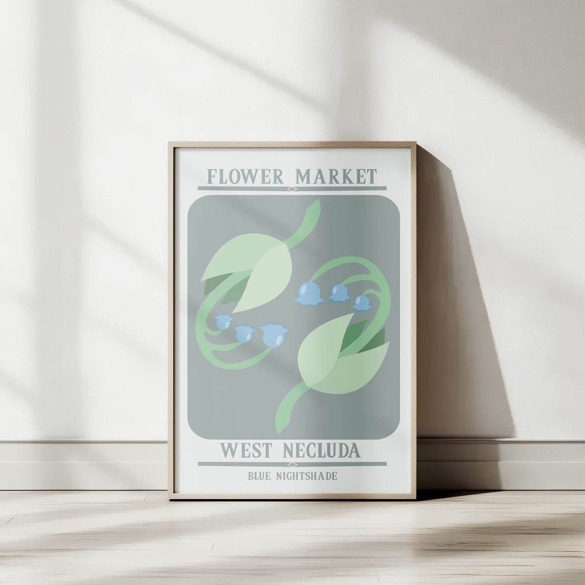
Two things crossed in my head: the soft, oversized typography of European flower-market posters, and the in-game flora of Breath of the Wild. I wanted wall art a casual fan would actually hang in a living room — not a poster covered in game logos and pop-culture quotes. Just the flowers, the place, and a label.
The brief I gave myself
One series, three posters, framed for a real wall. Each one named after the plant and the region it grows in. Restrained palette per poster. Vector-only so they could print at any size without losing crispness. No fan-art clichés.
From sketch to vector
Each flower started as a rough study — proportions, leaf direction, stamen placement. From there I moved into Inkscape and built each one shape-by-shape with the smallest set of nodes that still felt botanical. The hardest part wasn't drawing the flowers; it was choosing what to leave out.
What I'd carry into the next set
The series taught me how much weight a single label carries when there's almost nothing else on the page. The next set will lean even further into negative space and bring in a quiet ornament — something subtle to tie all the posters together as a collection.
— Lana