Furusato means "hometown" in Japanese. I invented a streetfood festival to test whether I could build a full campaign from scratch — not just a logo, but the apparel a vendor would wear, the banners a guest would walk past, the small marks that hold the whole thing together. The festival isn't real. The brand could be.
The mark
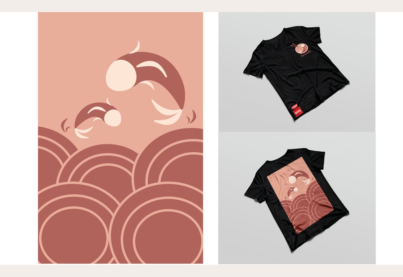
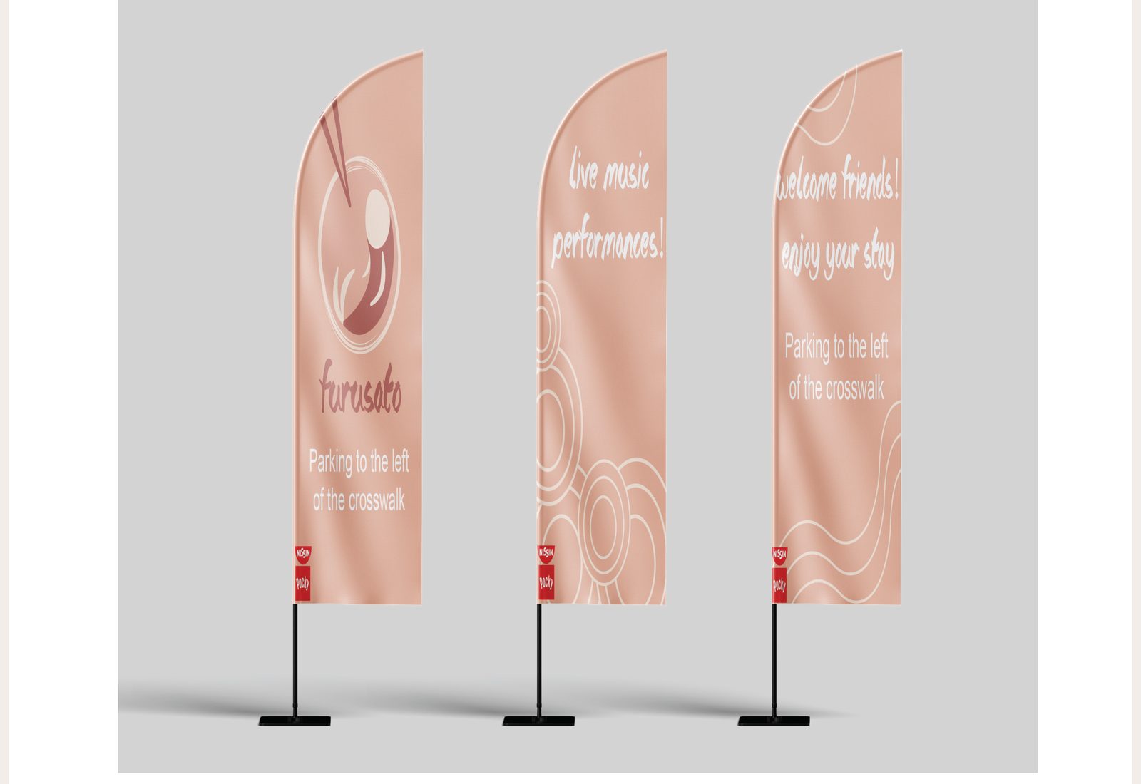
A bowl, two chopsticks, the suggestion of broth. The hand-drawn wordmark in the script font keeps the warmth — type that feels like a sign painted that morning, not exported from a brand book. Three lockups: full color on light, white on dark, small icon-only for cases where the wordmark would crowd.
What the system holds
The trick wasn't drawing the bowl. It was making sure the bowl, the script, the pattern, and the banner type all felt like they came from the same hand. I picked a single warm dusty-rose palette, drew the wave pattern from the same brush as the wordmark, and let everything else — body type, banner sub-copy — sit quietly behind it.
What I'd do next
The next pass would add a printed program with vendor map, a small set of social tiles, and a one-page sponsorship deck. The brand can already carry that weight — it just hasn't been asked to yet.
— Lana